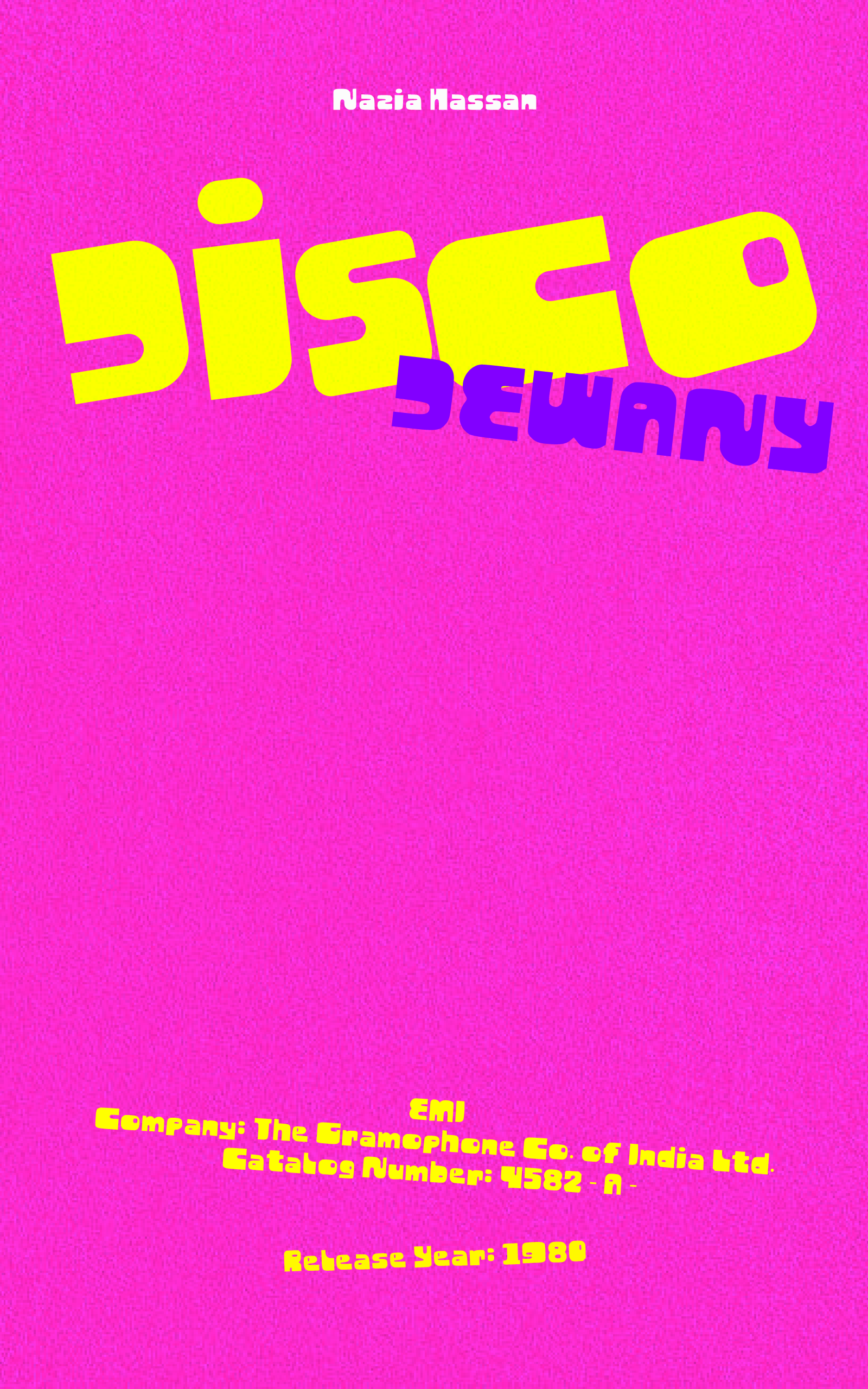
Concept & Purpose:
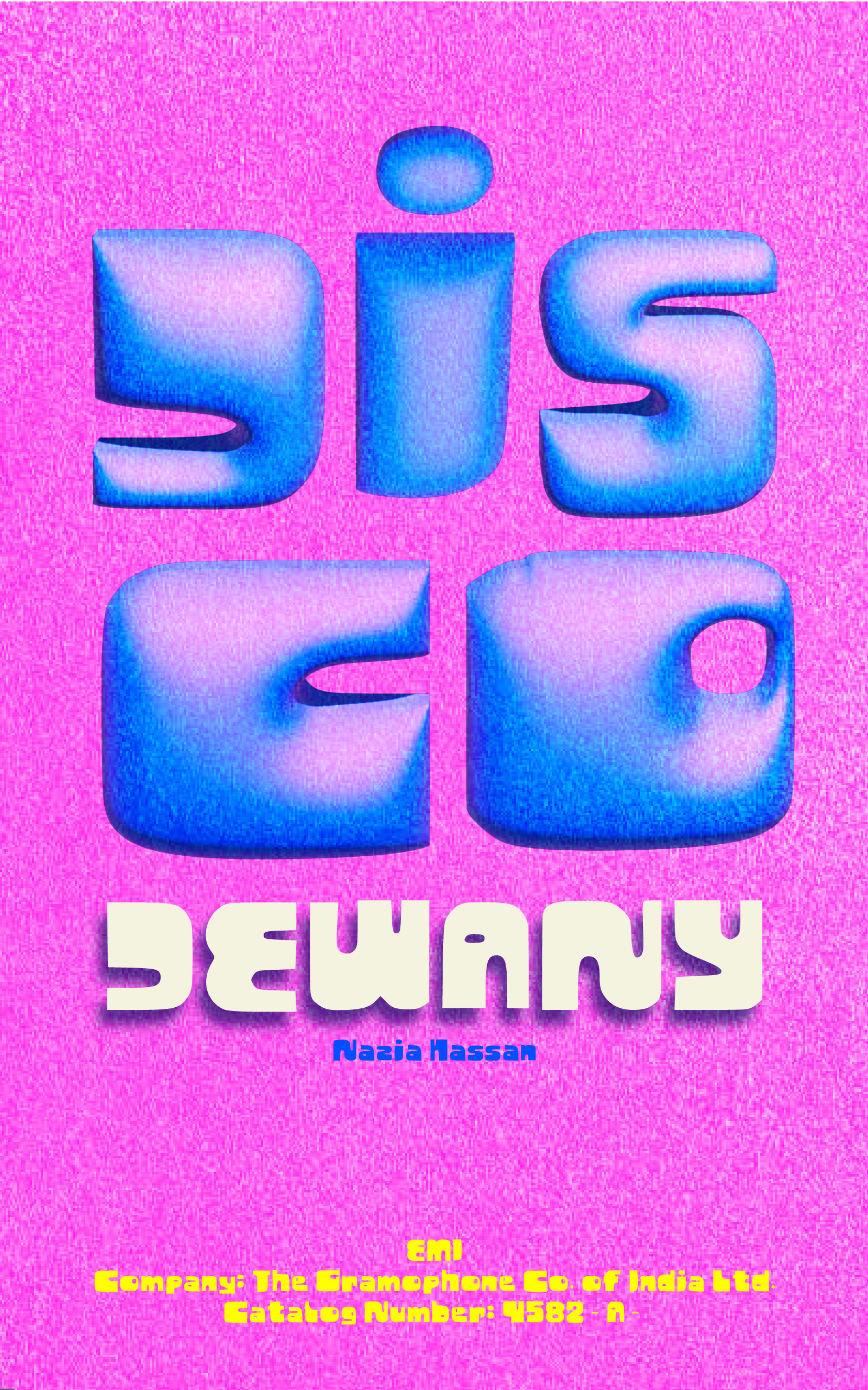
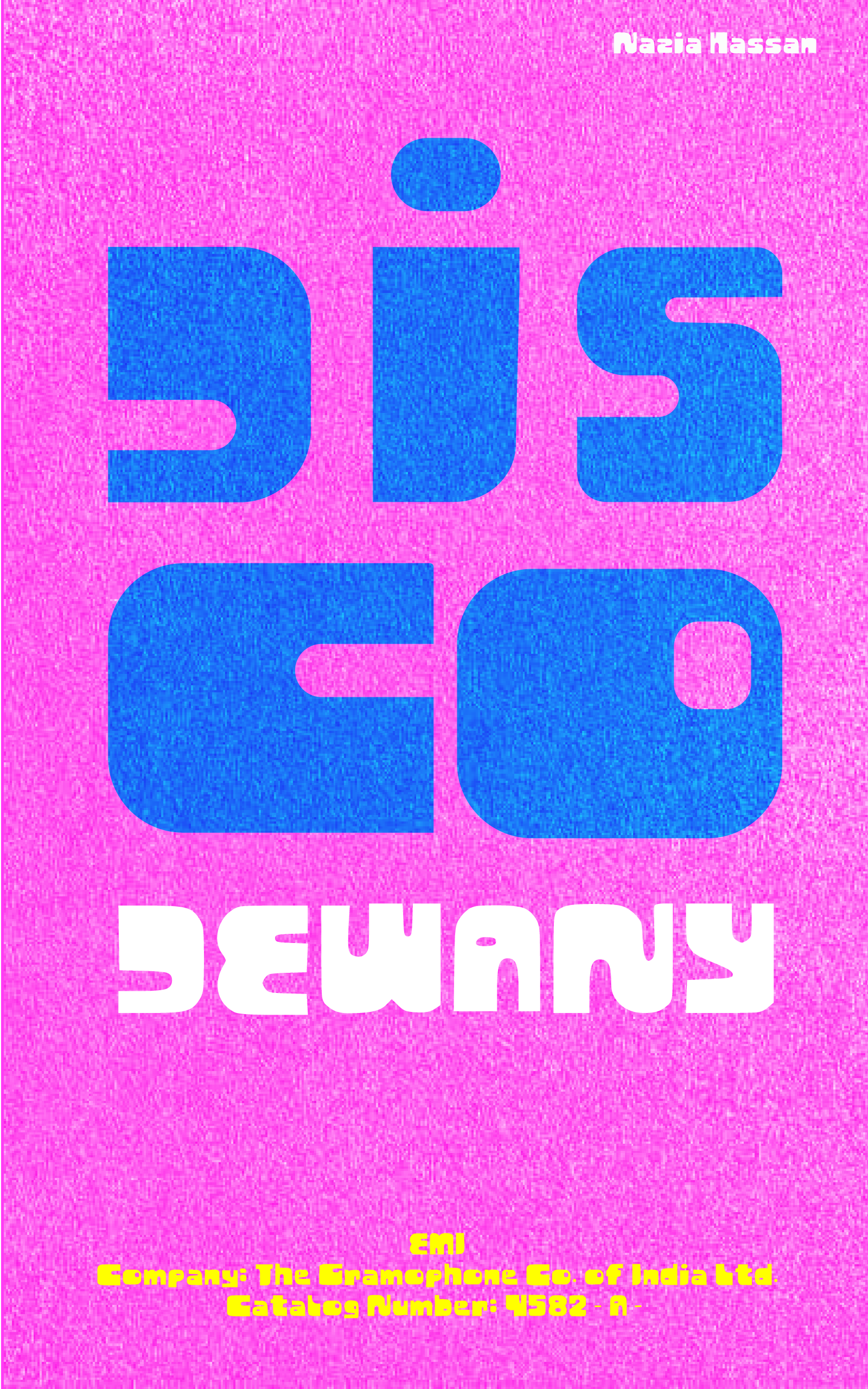
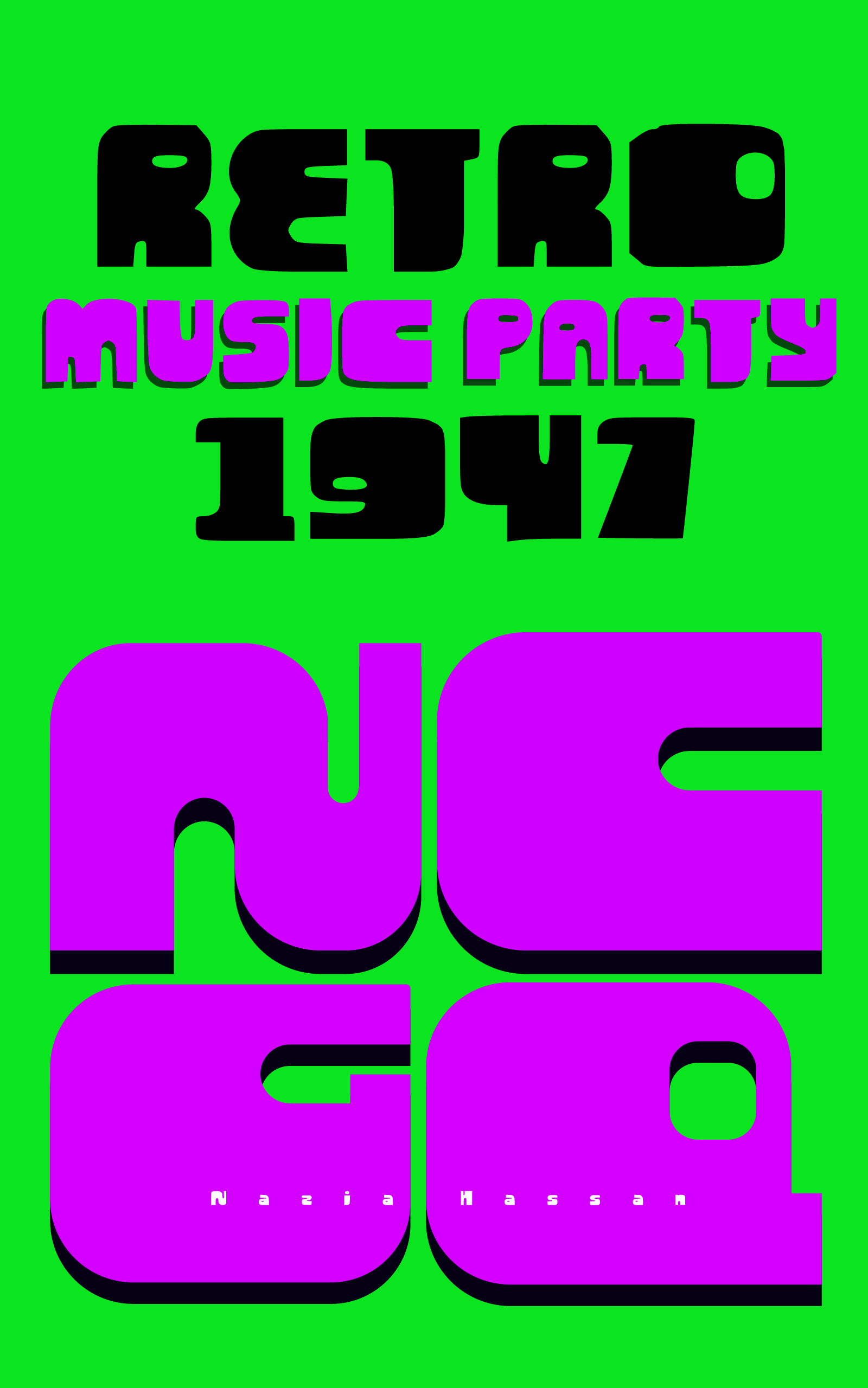
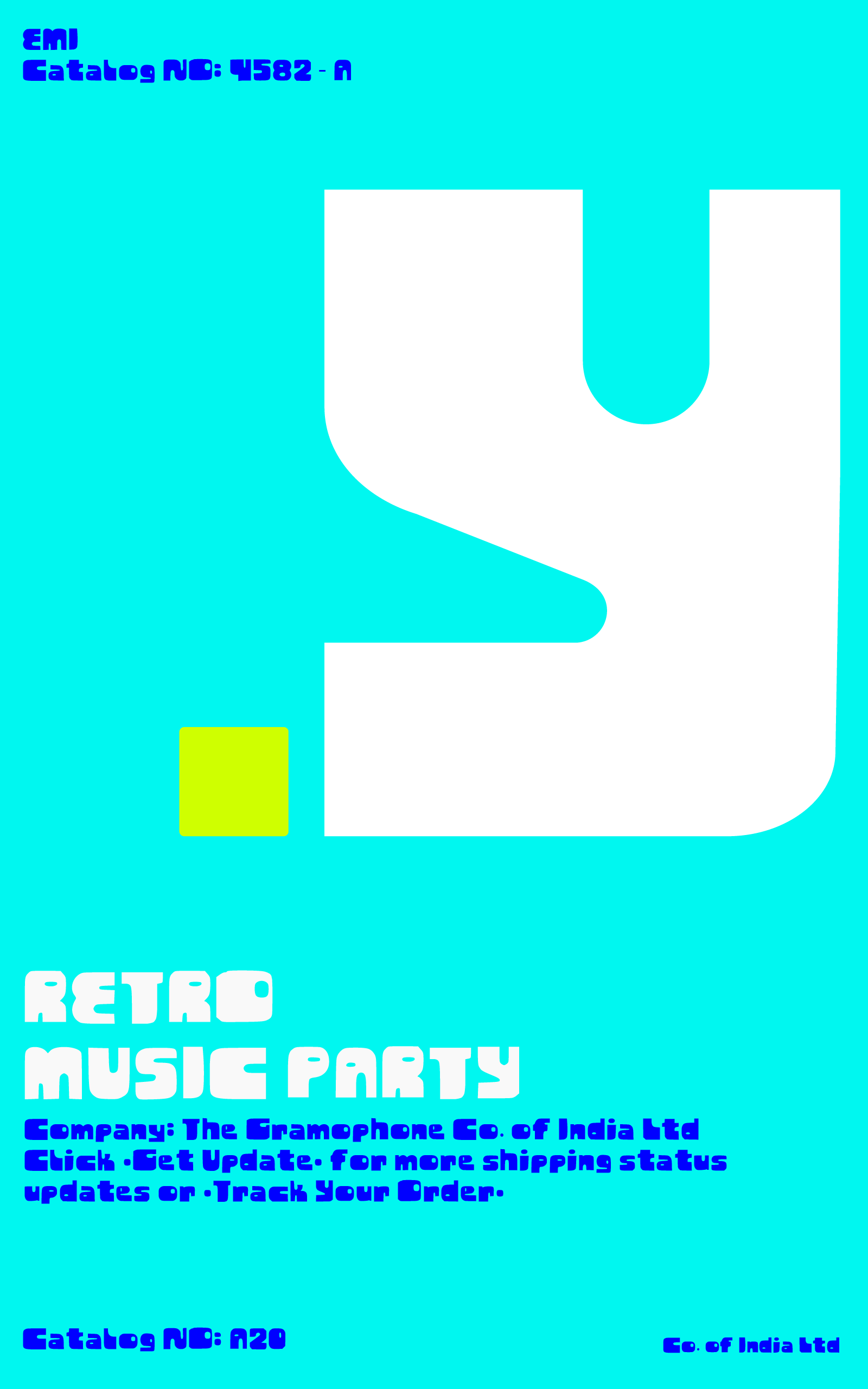
This typeface balances bold visual impact with clear legibility. Designed primarily for book titles, posters, and editorial covers, it captures immediate attention through heavy contrast, strong shapes, and a dynamic visual rhythm.
The Design Challenge:
The goal was to unify three distinct aesthetic influences: 1970s psychedelic music culture, structural modular experimentation, and futuristic sci-fi aesthetics. By identifying shared qualities—boldness and visual drama—the font bridges these themes into one cohesive typographic system
Historical Influences:
The design synthesizes 1970s psychedelic vinyl culture, Bauhaus geometric modernism, and retro-futuristic sci-fi typography. This blend balances fluid curves and sharp geometric transitions with a grounded structural foundation
CALL TO ALL BEES
PLAY
BEEF

play beef


24.06.3026

RUMA: 5700
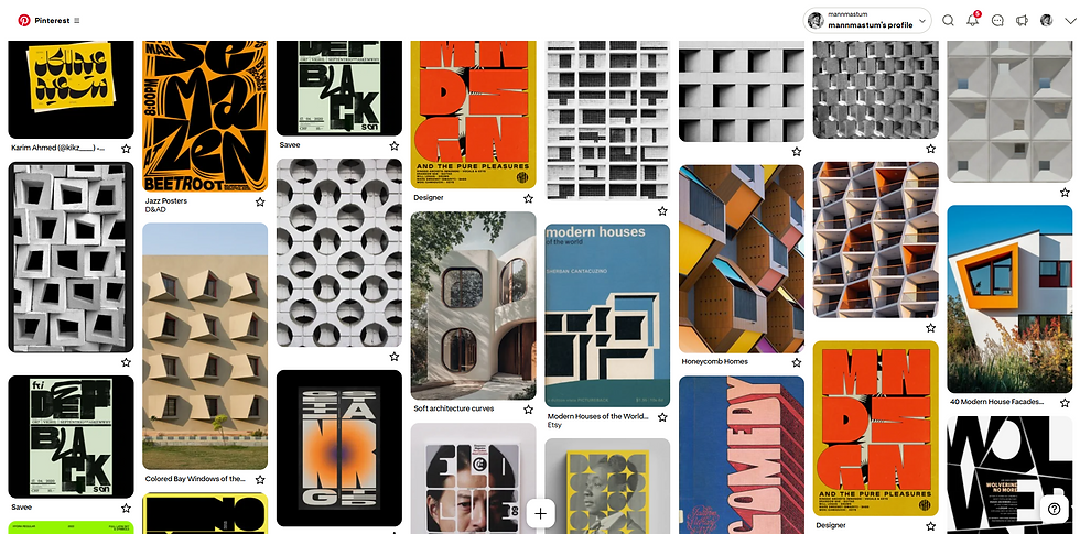


BEHIND THE TYPO
Inspiration and concept:
The journey started with a fascination for architectural geometry—specifically repetitive window patterns, brutalist facades, and solid blocks.
Final Typeface
The result is a bold, display typeface built for strong visual statements.
I explored how negative space, structural weight, and rigid grid systems could translate into letterforms.
Initial Explorations & Sketching
Moving from reference to paper, I began drafting raw letterforms using grid lines. The focus was on balancing heavy, blocky masses with small, intentional cutouts and curves—mimicking window frames.
Vectorization & Digital Refinement
Once the character set was finalized on paper, every glyph was digitized and precisely aligned to a strict grid using Adobe Illustrator.